Monday 6 May 2013

05 March 2013 - Contents Page anaylsis

Examples of 3 content pages

  • The main picture on the contest page is sized quite large so that it would attract the readers attention more than the rest of the page
  • The colour scheme of the contents is Black, White and Yellow. These is a very basic colour scheme which means that it'll help to make it 'easy on the eye' for the readers in order to make it easier to read the text
  • The layout of the conents page is in four columns - that's excluding the editors section on the bottom left - this helps the reader to be able to easily read the contents
  • The title of the contents page is larger in font size than the other text. This is because the editor wanted to make the title stand out more to the audience in order for the readers to be informed before they read on
  • The use of the other images inform the reader that there are still more interesting articles inside the magazine

  • The way in which the pictures are layed out make it seem to the audience that there are other interesting articles in the whole magazine
  • The size of all the pictures are all the same except the main picture (which features the main article), this is because it evokes to the reader that all the articles are in equal significance in the magazine
  • The colour scheme is also Black, White and Yellow which then again helps the audience to easily read the contents
  • The text layout is in one colunm which does help to organise the text but makes it more diffuct to read compared to a piece of text that was spilt into 3colunms
  • As all the pictures were placed on the left of the contents on the right this means that the first thing the audience will see is the pictures. As we read from left to right our minds automatically look from left to right, hence the meaning to why rhe readers will see the pictures first
  • The size of the text of the Title is big compared to the size of the text of the contents. The editor purposly did this in order to intend for the title to be a key highlight of the page
  • The main picture is deliberatly made in a large scale in order to make it seems to a main significance for the magazine
  • The layout of the contents is in one colunm which again - like the magazine above - its helps to organise the page but its not as effective for making it easy for the audience to read. This is due to the fact that it may seem 'bunched up' or too close together
  • The title and the logo of the music magazine are pretty much placed one after the other. This is that when the audience look at the title of the page, they'll recognise what magazine they are reading
  • The colour scheme on this magazine conents page is Black, White and Red. This is a basic colour scheme that fits im well with the colour of the magazine logo and also the magazine itself
  • Each sigle thing with red on it, is highlighted by the editor to be a main suject to this magazine


28 January 2013 - School Magazine Cover Page


This is what I had done in my double lesson of media studies. What I would like to do is to finish off the title by either continuing to take off the black background off or to completely remove the title and just add a new title that has the same font as the article headlines in the front of the page.

I like that the colours of the cover page image actually blends in with the colours of the school logo thus making it stand out even more and also helps to match the colour scheme of my blog (which are the school colours; Red, Blue, Orange, Green, Yellow and Purple.

What I now need to definitely work on is to start up my contents page and make sure that it matches with the front cover of the school magazine. As shown by my previous posts I will use my contents page draft as a sample of what I would like my final page to look like. 

04 March 2013 - Pictures of Music Magazine

Pictures I have taken for my Music Magazine

Good pictures:


What I had particularly liked about this picture is that it's quite a natural mid-shot as my model wasn't looking directly into the camera. Also the lighting creates a very dark and sinister yet urban feel to the image.


This image is a head-shot of the model and what I had liked about this shot is that the model yet again is natural looking whilst with the lighting it add a contrast to the natural shot. As this is a head-shot it enables the viewers to have an insight onto the models emotion.


This is a beautiful head-shot of the model and what I really admired about this image is the lighting in this picture. The lighting illuminates the complexion of the model and highlights the great parts of her face.


The way in which I had made the model pose was the relate to the title of the music magazine and also it creates a very deviant emotion. The lighting in this picture compromises with the pose of the model.


The way in which the model is posed in this head-shot image is denoting to the readers that she is trying to portray a dominant status as her facial features emphasise that.


The pose that the model is doing is similar to the one a few pictures above - and as I had written before - it relates to the title of the magazine, but the lighting on this picture is different as it was taken indoors. I like them both but each picture has their pros and cons.


This mid-shot of my model is stunning as she's doing a natural pose like most of the pictures above but the lighting ins't as light on the skin as some of the other outdoor pictures. The way in which her hair creates a small shadow across her face gives her a mysterious side of her.


This is my favourite picture that I had taken out of all the photo's for the music magazine. The shot angle that I used is high angle shot. The lighting in this picture is perfect as it illuminates her face in all the right places, making her seem innocent and the same time a double side to her that she hasn't revealed. The mid-shot photo helps the readers to see her facial features as well as make her seem the most dominant from the whole picture.

Bad pictures:


This picture has quite dark lighting therefore not being able to emphasise her as the dominant subject of the frame. Plus the models hair is in her face so the audience is not being able to see her facial emotions. Even though I used a mid-shot camera shot I still think that it doesn't do much to show much about the models character.


This picture is quite similar to the image above but the model is looking straight into the camera. As this is a mid-shot, the model's facial expression is not clearly shown to the audience.


In this low shot image the model doesn't look at all attractive to the viewers and the models face doesn't show any characteristics. The model's chin also doesn't look suitable for the frame shot as her chin looks quite out of poportion. The only good thing about this image is that the lighting is perfect as it covers her highlights and lowlights.


The models pose in this close up shot doesn't suit the genre of the magazine as the model is looking at the left side of the frame, making her look awkward as the whites of her eyes attract to much attention. The way in which her mouth shows her front teeth also makes the image look out of place.


This long shot of the model doesn't give much appeal to the audience as this picture looks like a normal, casual picture taken of a random person - there is nothing special about it. An upside to this picture is that the shadow behind the model gives a nice effect for the image.


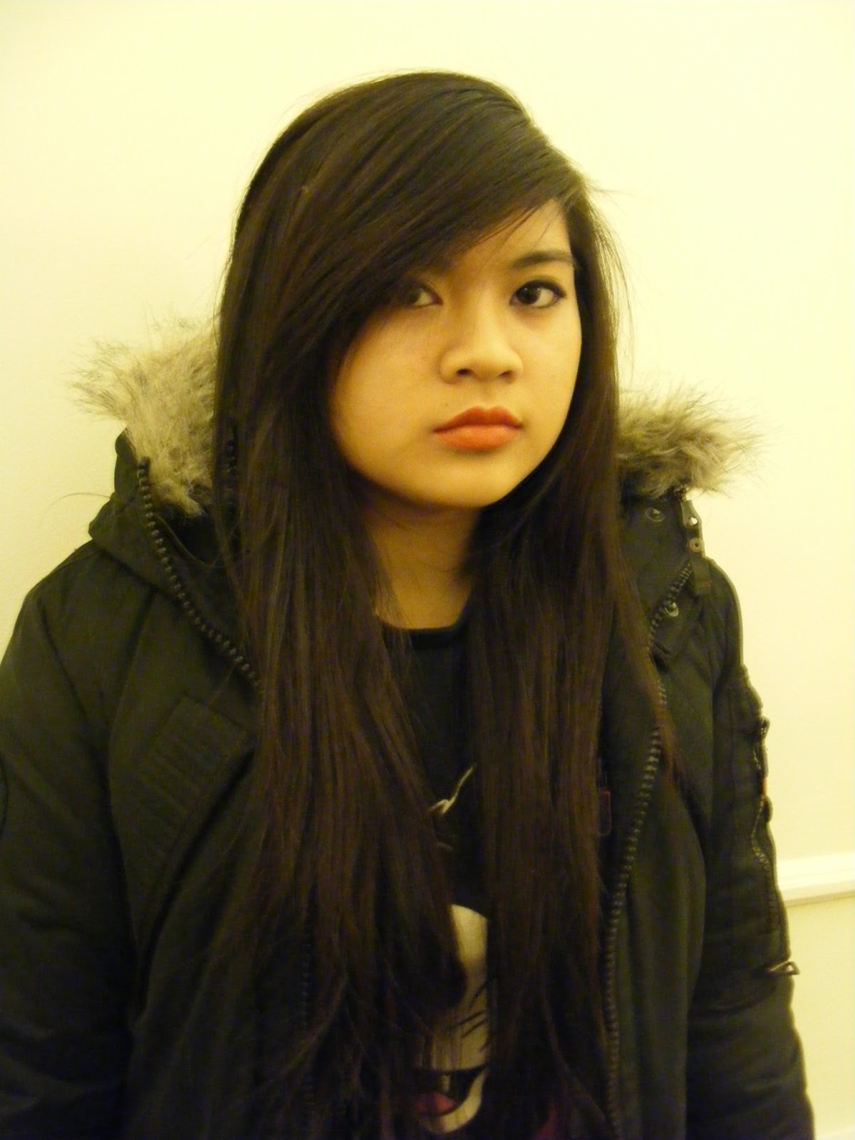
First of all, the lighting of this picture is too red/orange therefore making the models face look orange which isn't what I had intended in this shot. The camrea shot in this image - which is a mid-shot - isn't bad but as what I want the audience to focus on is her facial expression it doesn't give the audience a clear image of her face.


The lighting in this image is the same as the one above, meaning that yet again the model seems to orange in her complexion. I like the pose of the model in this long shot but as her hair is covering most of her face it doesn't show much of her emotion.


The mid/close-up shot of the model isn't as effective as I had thought as the models facial expression doesn't seem to be really connecting to the audience, as her eyeline is directed to the right side of the frame. The lighting of this picture doesn't seem to go well with her complexion as her skin tone is coming out quite a dark yellow which wasn't what I was going for. Also the people walking in the background make the picture look less profesional.


In this close-up shot the models facial expression looks odd in comparison to the genre of my music magazine - which is Rock/Metal. The lighting of this picture doesn't blend well with her skin complexion as the background is a dark cream colour and her face is a dark yellow colour - I wanted her skin to look flawless. 


In this close-up shot yet again the models facial expression looks odd in comparison to the genre of my music magazine. And again the lighting of this image (similar to the one above) makes the models face seems too dark - the hightlights and shadows of her face seem in one tone - which doesn't make the model seem appealing to the audience at all.

04 March 2013 - Music Magazine Questionnaire


Questionnaire for Music Magazine
  1. What kind of genre of music do you like?
    [ ] Pop/Mainstream   [ ] Rock/Alternative/Metal   [ ] Classical   [ ] Other

    Other: _______________________________________________________________________

  2. Would you buy a music magazine on your favourite genre?
    [ ] Yes   [ ] No   [ ] I don't know

  3. If yes, how much would you buy the magazine for?
    [ ] £1-£1.99   [ ] £2-2.99   [ ] £3-3.99

  4. What would you like to see featured in music magazines in general?
    [ ] Upcoming artists   [ ] Gigs   [ ] Gossip   [ ] New Albums   [ ] Other
    Other: _______________________________________________________________________

  5. Which sell-line stands out to you the most?
    [ ] Top 10 artists 2013!   [ ] Knitting, Tea Time and Rock 'n' Roll?   [ ] Make or Break?

  6. What could you imagine on the front cover of a Rock/Metal magazine?
    [ ] Black and scary   [ ] Demonic   [ ] Crazy and Cool   [ ] Informal Language

  7. Do you know any of these bands? Tick which ones you do if not leave them blank
    [ ] Metallica   [ ] Iron Maiden   [ ] Slipknot   [ ] Korn   [ ] Ozzy Osbourne

  8. If you didn't know any bands then why? If you did then skip to Q9
    [ ] I don't like/listen to their music   [ ] Not my taste in genre   [ ] Other
    Other: _______________________________________________________________________

  9. Out of all the genre's of Alternative music which genre do you prefer the most?
    [ ] Rock   [ ] Indie   [ ] Heavy Metal   [ ] Screamo   [ ] Grunge   [ ] Other
    Other: _______________________________________________________________________

04 March 2013 - Examples of Double-Page spreads

3 Examples of Double-Page spreads in Music Magazines


  • The huge 'L' in the middle of the text emphasises the celebrity that the interview is based on and because the colour of the letter is red and the rest of the double-page spread is in black and white it draws our attention to that letter
  • The colour of the letter is also the same colour used in the magazine's title and logo (Q Magazine)
  • The fact that there is no title with this double-page spread could mean that perhaps the reader would have to read on in order to find out what it's really about therefore either way the reader will always read at least a paragraph or two before deciding to read on
  • The picture takes up one whole page of the double-page spread meaning that all of our main focus and attention is on the picture itself
  • The mid-shot photo of the model tells the audience that the model has some sort of significance to this article
  • The model is featured wearing an outfit and posing in a way that would entice the readers which find the female form attractive. Editors of the magazine had made sure to include some sexual content in order to attract more readers as in from society today sexual icons/contents sell well
  • The layout of the text is in three columns  making it easier for the audience to read as well as making the text more appealing


  • The border of the double-page spread looks similar to the round lights you would get on a mirror for celebrities when the get ready for their 'shot' therefore accentuating the role of this model as being quite a well-known person
  • The model itself is posed in a manner to say to the audience that he's just a regular man and as there is no sexual relation to the picture it shows that the model is mainly known for other purposes; in this case his music
  • The size and the font of the title both make the double-page spread stand out to may readers. As the size of the title is quite large compared to the text and the colours of the title (pink & white) are not always used in the information of the article therefore catching the readers attention the the title
  • The layout of the the text is set into three columns, making it easier for the audience to read and also to make the double-page spread look more appealing as it won't look too clustered together


  • The main picture of the double-page spread is of a music artist and it takes up one page of the double-page spread therefore showing some sort of main significance to the article
  • The model in the main picture seems to be posing as if to make it seem he's in a concert playing a live show as the props used (ie. electric guitar) emphasise this
  • The other little pictures around the main picture and at the bottom of the text show that the artists in the pictures are also a significance to this article but not as much as a main subject of matter 
  • The title of the article is in different types of fonts therefore perhaps showing the mixture of the information in the article or perhaps the mixture of artists that are included in the article all together
  • The colours and size of the title helps to draw the readers attention, as the colour of the title (white & blue) seem to be the main colours of the double-page spread, and the size of the title is quite large compared to the text thus adjusting the main focus to the title (that's not including the picture)


11 February 2013 - Task 3 continue

Sell Lines
What kind of stories will your audience expect?
As my music magazine's genre is Rock/Metal, the types of stories that would be included are:
  • Latest concerts in and around the UK
  • What's the latest Album (Top 10)
  • Up-coming festivals
  • Interviews (Relation to: Personal life, Relationships, Music ect)
  • 'Band of the Week'
  • Competitions (prizes such as concert tickets, vouchers to clothing lines,  free band merch)
  • New bands
  • Comic strip (with artist from last weeks front cover)
10 ideas for potential sell lines that will feature in your front cover:
  1. 25 Stories of Metal
  2. The Full Story of the Worlds Sickest Band!
  3. Beast and the Beat
  4. 50 Greatest Rock Stars
  5. 'To Die for' revealed, secret diary uncovered!
  6. We predict a Riot!
  7. Welcome to the future
  8. Off the Road again
  9. 'My life isn't complete without music'
  10. Sonisphere 2013
How much is your magazine going to be?

4 February 2013 - Task 4: Magazine Research

Photography: Front Cover
When doing a photoshoot you need to consider a few factor:
Model:
Probably a male model that is dressed in rather black or dark colours.
Location/Time:
Around a white/black backdrop if in a studio but if outside then with a 'forest' backgroud (in a big park) or perhaps at home? (doing everyday activities but more based around blood and gory.
Props/Costumes needed: (+connotations discussed)
Props:
  • Knife, Gun, Chains (weapon)
  • Music instruments (Guitars, microphones)